As more creators and small businesses managed their work from anywhere, Squarespace had an opportunity to rethink what website management could look like beyond the desktop. Rather than recreating every editing capability for mobile, we focused on the moments creators needed most: making updates, managing their site, and keeping their business moving. I helped shape a mobile foundation that balanced simplicity, flexibility, and long-term scalability across the platform.
Squarespace
Mobile
Squarespace mobile
Redefining how millions of creators manage their websites beyond the desktop.
ROLE
Product Designer
Scale
4M+ SUBSCRIPTIONS SERVING CREATORS & SMALL BUSINESSES WORLDWIDE
Timeline
~2 years
Platforms
iOS, Android
Focus
Platform Strategy, Design Systems, Information Architecture, Financial UX
Team
Product Design, PM, Engineering
Responsibilities
Strategy, IA, UX, UI, Systems

Understanding Creator Workflows
Rather than recreating every desktop capability on mobile, we focused on defining a more intentional experience around the workflows creators relied on most. Mobile became a place for quick updates, confident changes, and maintaining momentum, while desktop remained the space for deeper planning, building, and configuration.
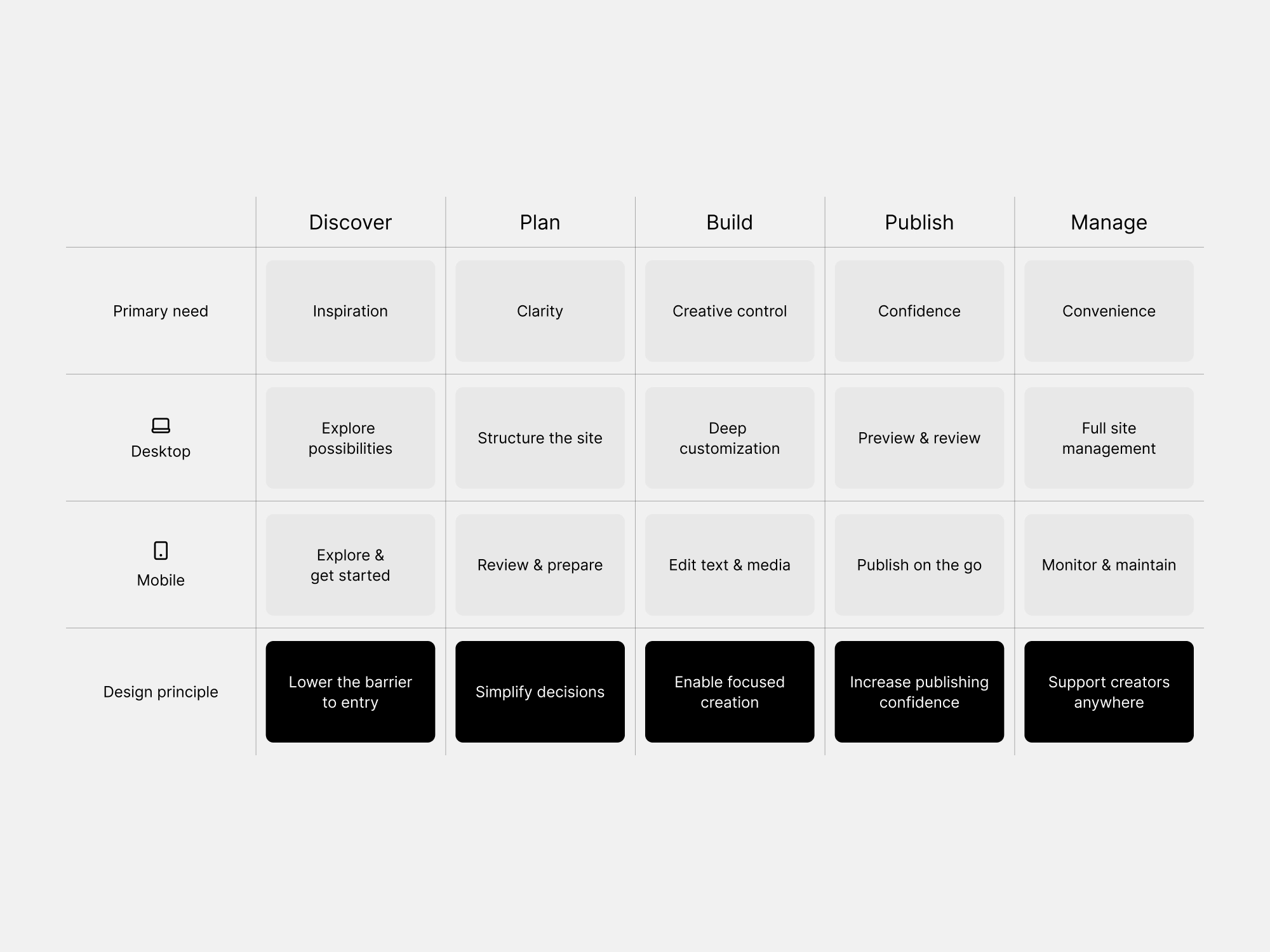
Defining Mobile's Role
With mobile's role established, we organized the experience around three primary editing paths (changing site styles, adding pages, and editing content) that reflected how creators naturally thought about managing their sites. This simplified navigation while creating a foundation that could scale as new capabilities and features were introduced.
Site styles • ADAPTING DESKTOP FOR MOBILE
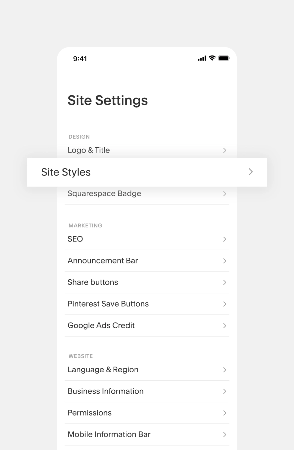
Bringing Site Styles to mobile meant preserving the depth of customization creators expected, without bringing the complexity of the desktop experience with it.
MAKING SITE STYLES EASIER TO NAVIGATE
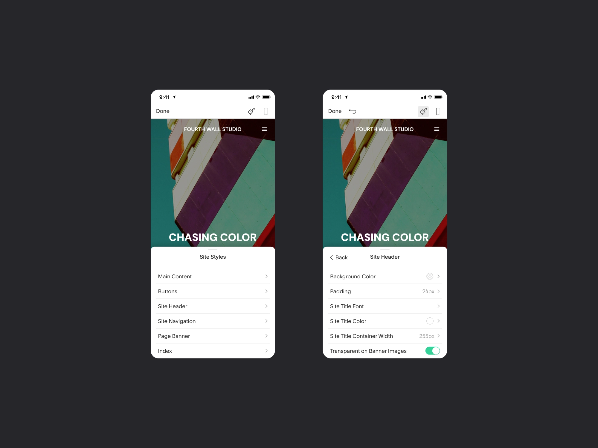
Site Styles included a deep set of options for typography, color, spacing, navigation, headers, buttons, and other elements across a creator’s site. Rather than presenting everything at once, I grouped these options by the parts of the site they affected, revealing more specific choices as users moved deeper. Keeping the site visible behind the controls also let creators see the effect of their changes as they made them, making detailed customization easier to manage on a smaller screen.
pages • STRUCTURE, SIMPLIFIED
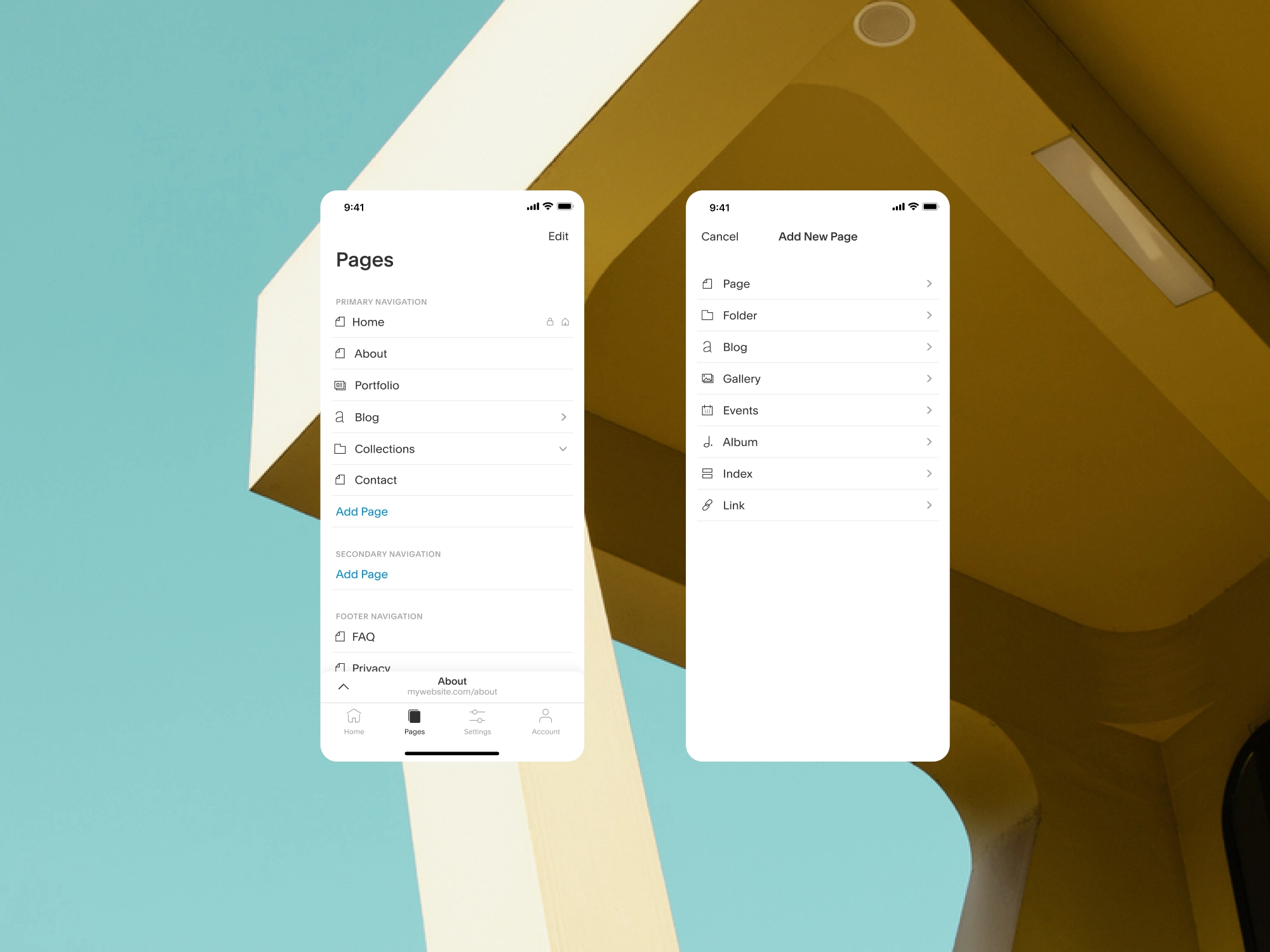
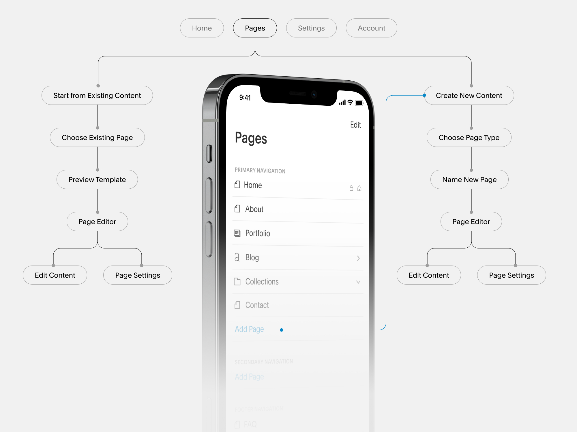
Managing a website meant navigating layers of pages, content types, and relationships. Bringing that experience to mobile required simplifying how creators moved through that structure without simplifying what they could create.
ONE STRUCTURE, CLEARER PATHS
Pages served as both a map of a creator’s site and the starting point for managing it. From one place, creators could understand how their site was organized, add new pages and content, and move into editing existing ones. We designed the mobile experience to keep that structure visible while separating each task into focused steps, making it easier to manage a full website without overwhelming a smaller screen.
EDITING • CREATE IN CONTEXT
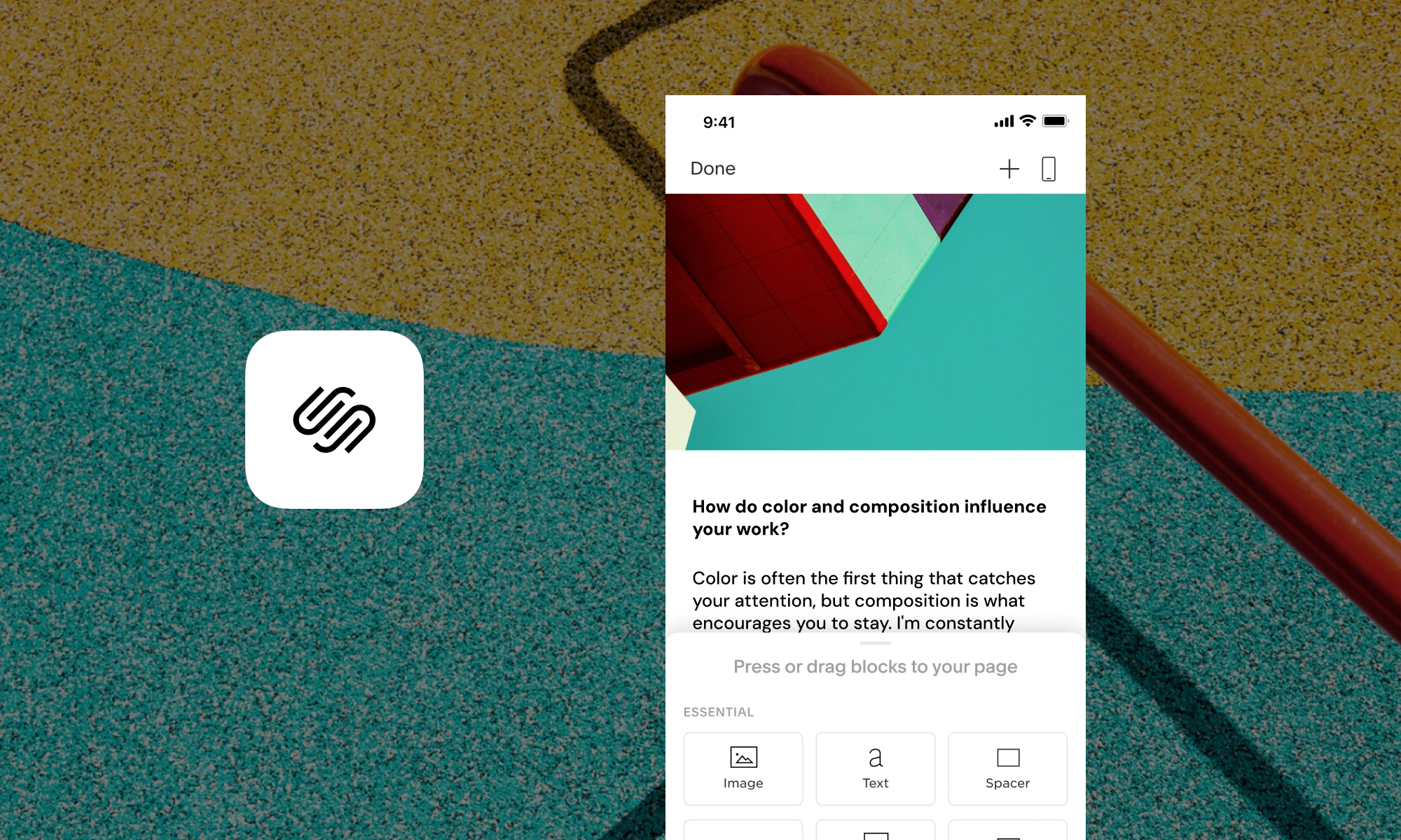
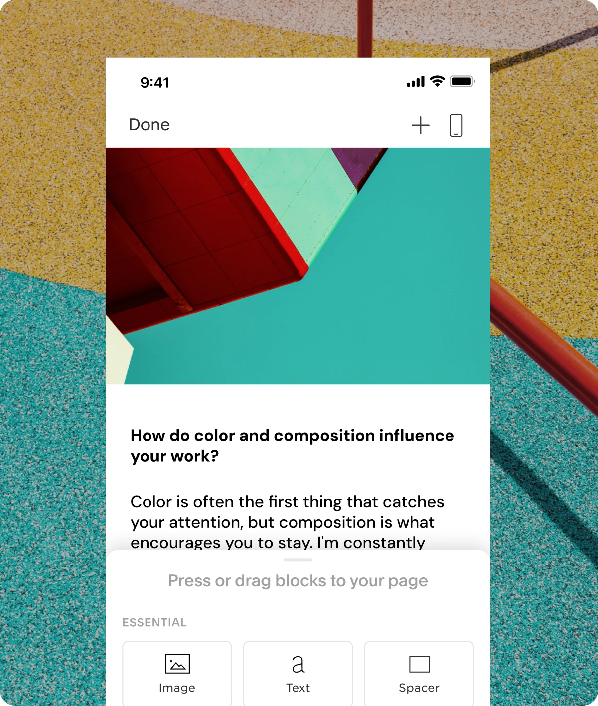
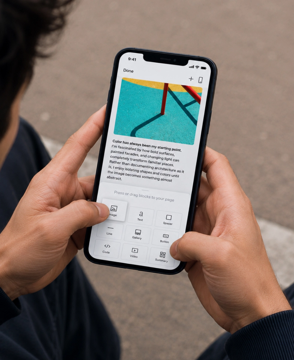
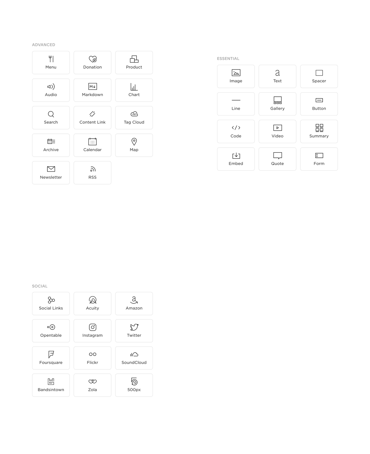
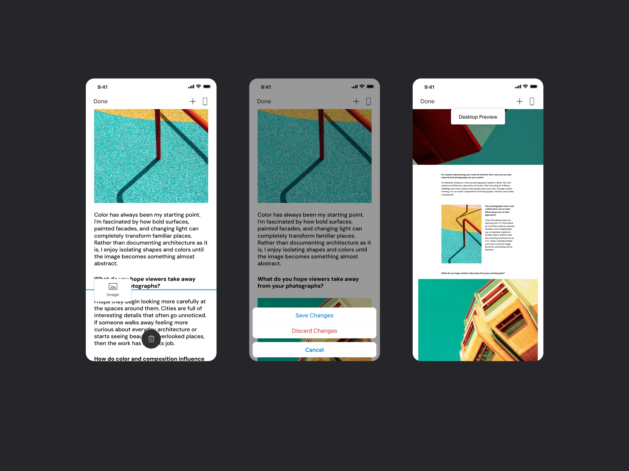
Creators needed the flexibility to build their site the way they wanted from mobile. The editor gave them access to a full set of content blocks they could add, arrange, and edit directly within the page, while keeping the site visible as they worked. This made editing feel less like configuring a page and more like building it in place.
DESIGNING AROUND THE CONTENT
Editing was designed to keep creators focused on the page rather than the editing tools around it. Content remained visible while blocks were added, edited, or removed, giving creators immediate context for each change. A desktop preview let creators check how their decisions translated to a larger screen before committing their changes, without leaving the mobile editing experience.
EVENTS • EXTENDING THE PATTERN
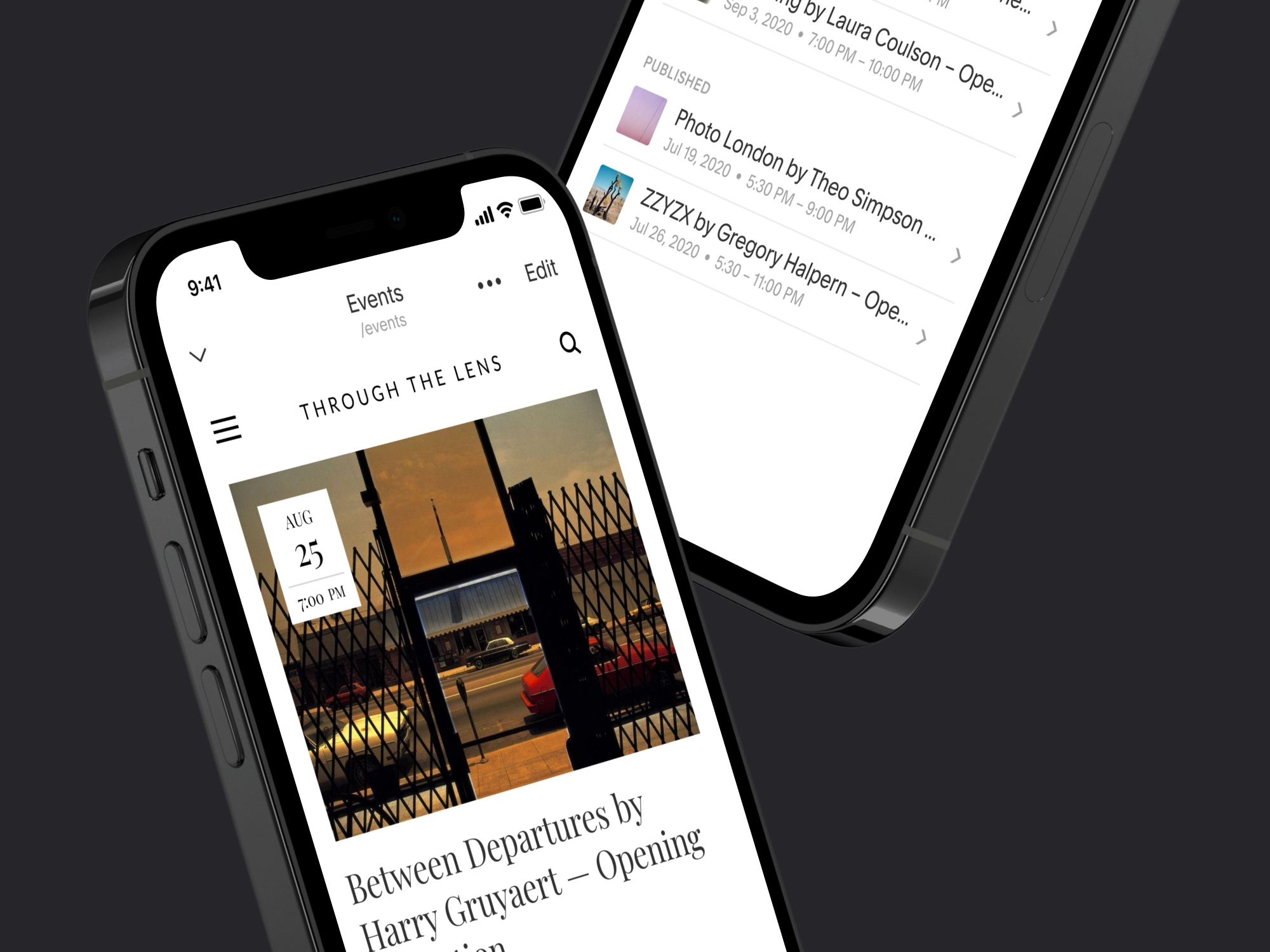
With the core mobile experience taking shape, Events became an opportunity to extend those patterns into a complete feature. Building on the way creators already managed Pages, I designed an end-to-end flow for creating, configuring, publishing, and managing events from mobile.
BUILDING ON A FAMILIAR FLOW
Events followed the same basic path as creating and managing a page, giving creators a familiar starting point before introducing event-specific details like date, time, location, and content. Reusing that flow reduced how much of the experience needed to feel new, while giving Events the flexibility to support the additional setup required to create, publish, and manage an event from mobile.
Translating User Needs into Product Decisions
Before deciding what Events should look like on mobile, I defined what creators needed to accomplish. Jobs to be Done turned those needs into clear product priorities, creating a foundation for exploring how Events should be structured, configured, and managed on mobile.
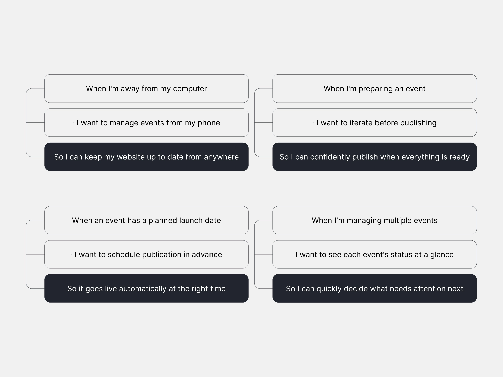
FROM JTBD TO PRODUCT STRUCTURE
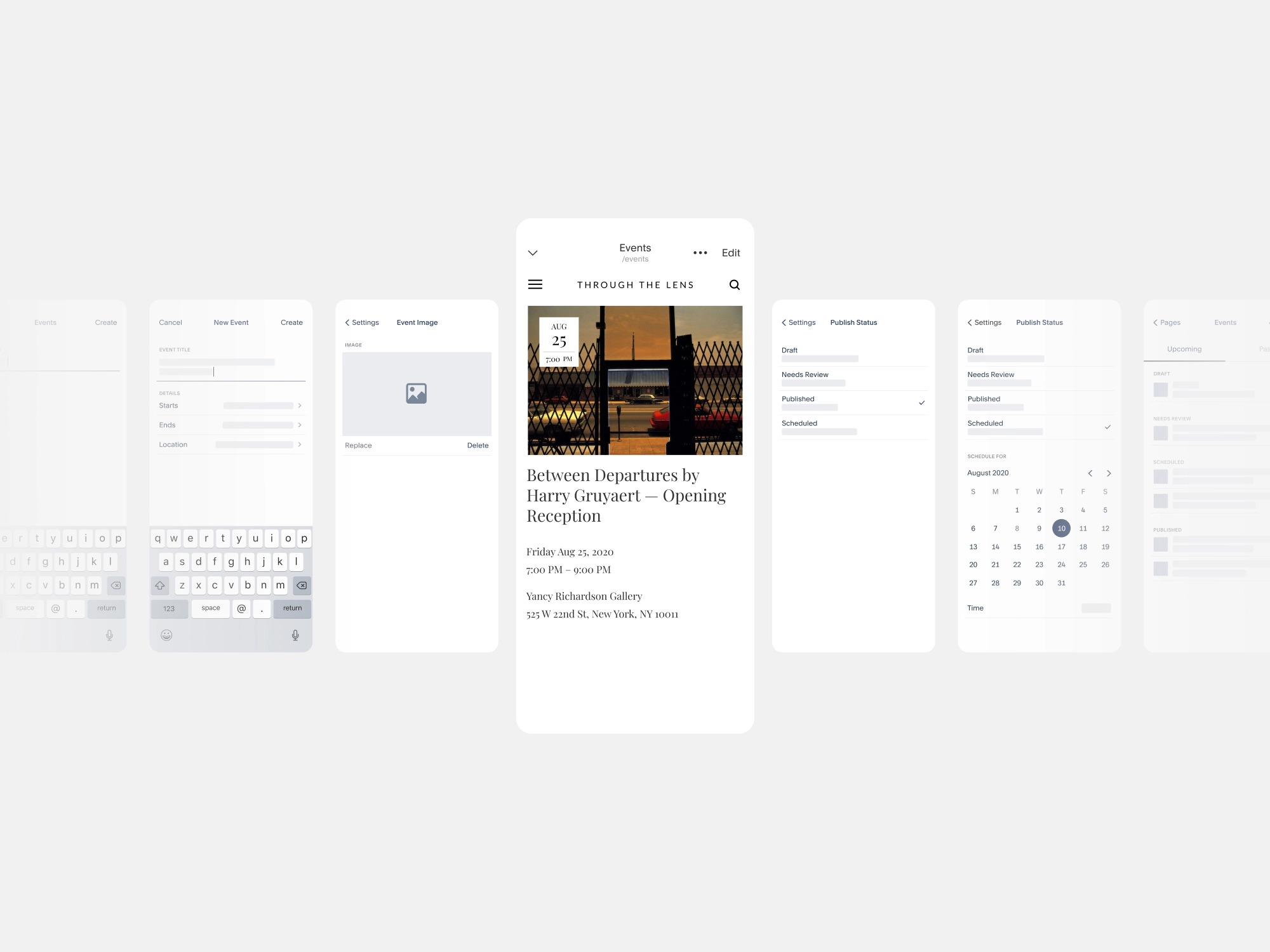
With the core jobs defined, I translated them into the structure of the experience. Early wireframes helped me work through how creators would create and configure an event, move between editing and settings, manage publishing states, schedule events, and understand status across multiple events. Working at low fidelity let me focus on these relationships before moving into visual design.
FINAL EXPERIENCE • FROM SETUP TO PUBLISHING
The final experience brought the full event lifecycle to mobile, giving creators a clear path from creating and configuring an event to publishing, scheduling, and managing what came next.
A NEW PAGE, A FAMILIAR PATH
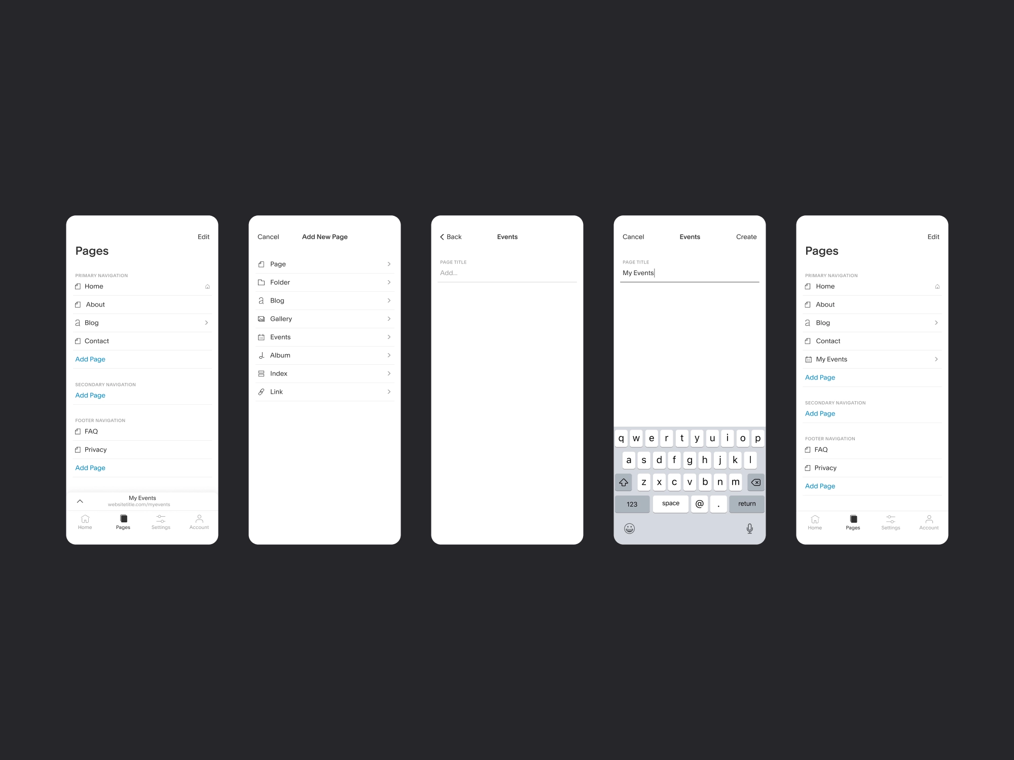
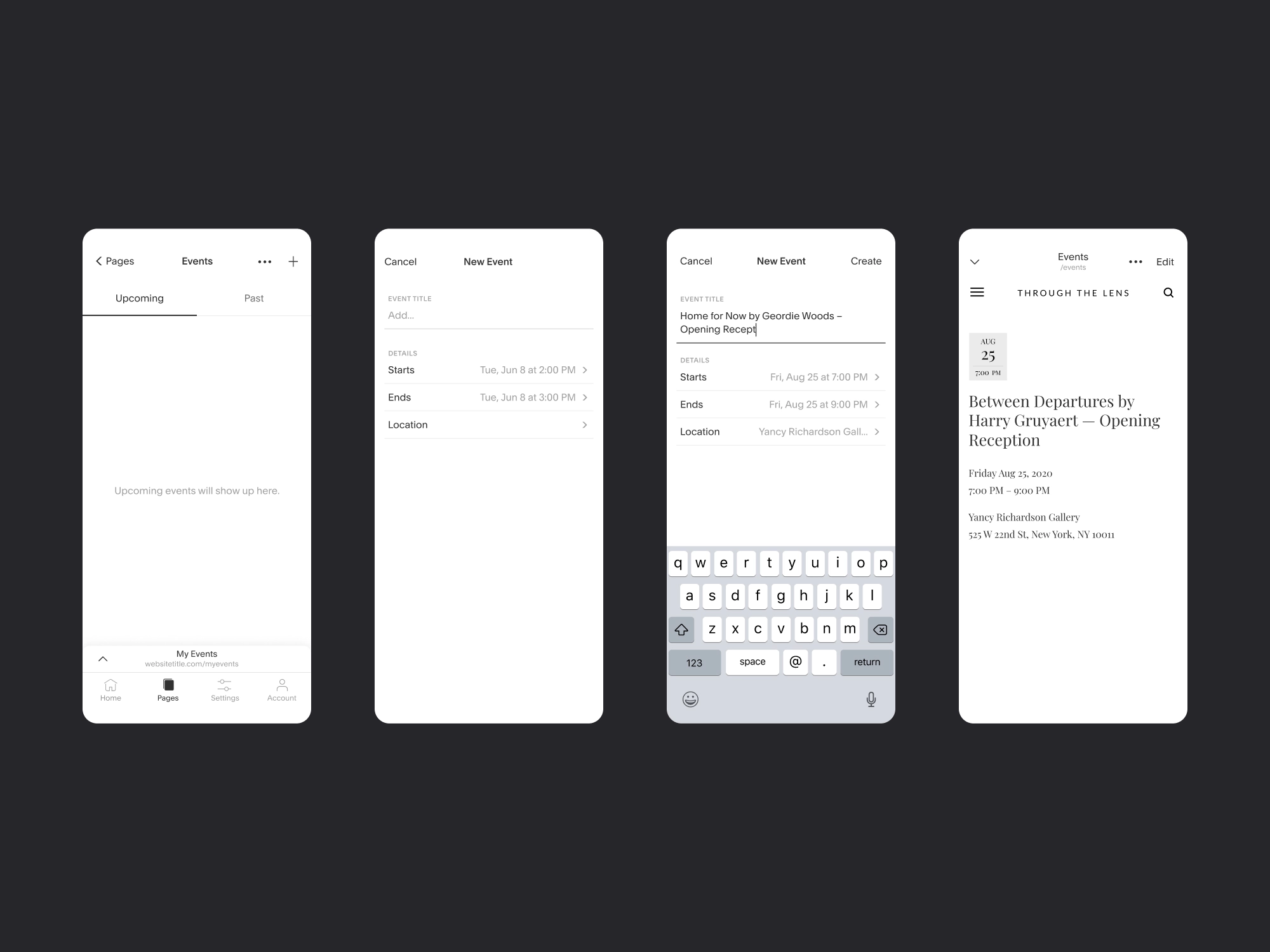
Events entered the site through the same flow creators already used to add other page types. Rather than introducing a separate path, I extended the existing Pages flow so creators could add an Events page alongside blogs, galleries, albums, and other content. This kept a new feature grounded in a familiar part of the product and preserved consistency across the broader mobile experience.
ESSENTIALS FIRST, DETAILS LATER
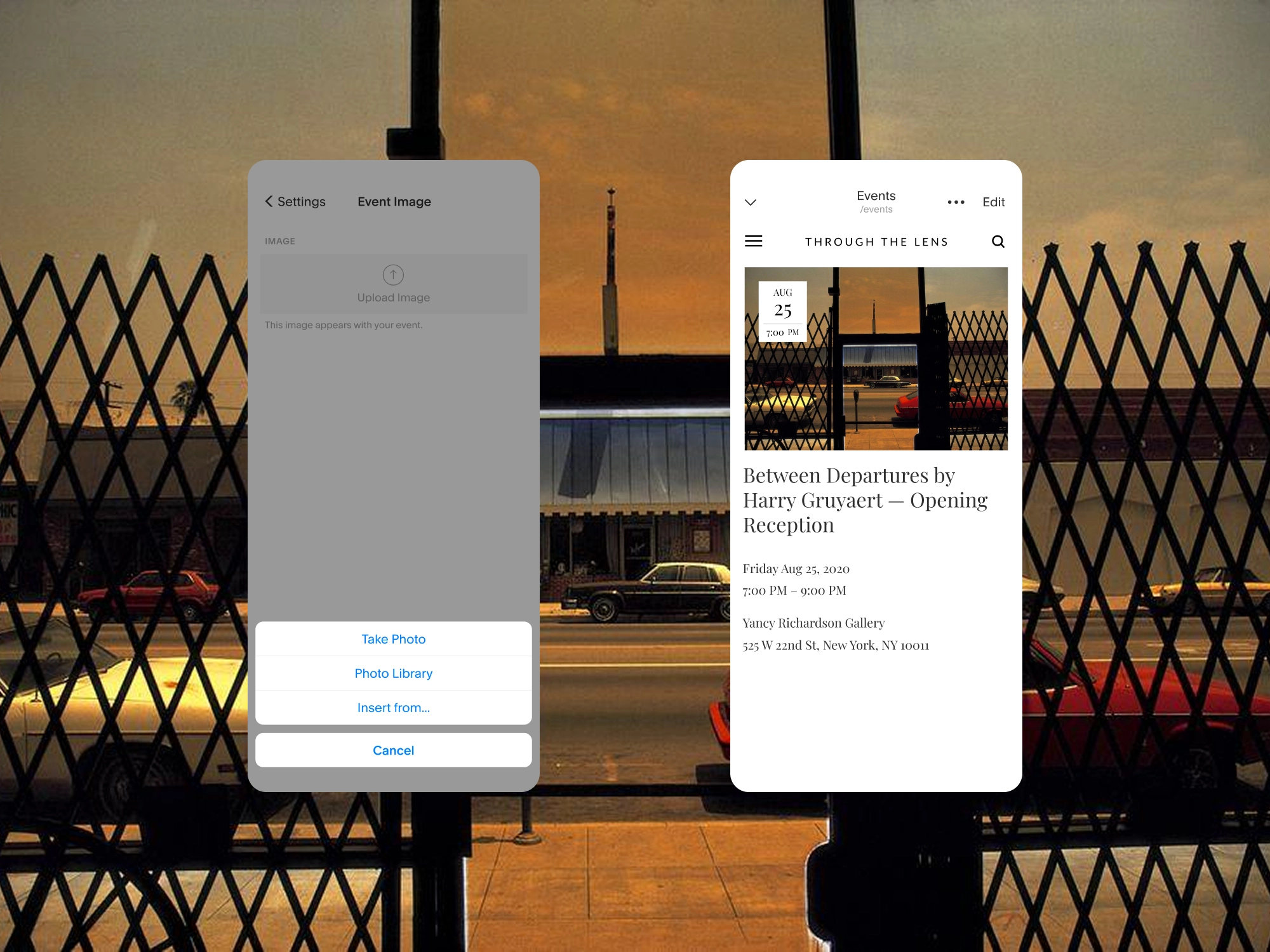
Creating a new event post required a different approach. I prioritized the essential details: what, when, and where, so creators could establish an event quickly while on the go. Once created, they could return to add the details that required more time and attention, including descriptions, imagery, publishing options, and other event settings. This kept initial creation lightweight without limiting how fully an event could be configured.
KEEPING TRACK OF WHAT’S NEXT
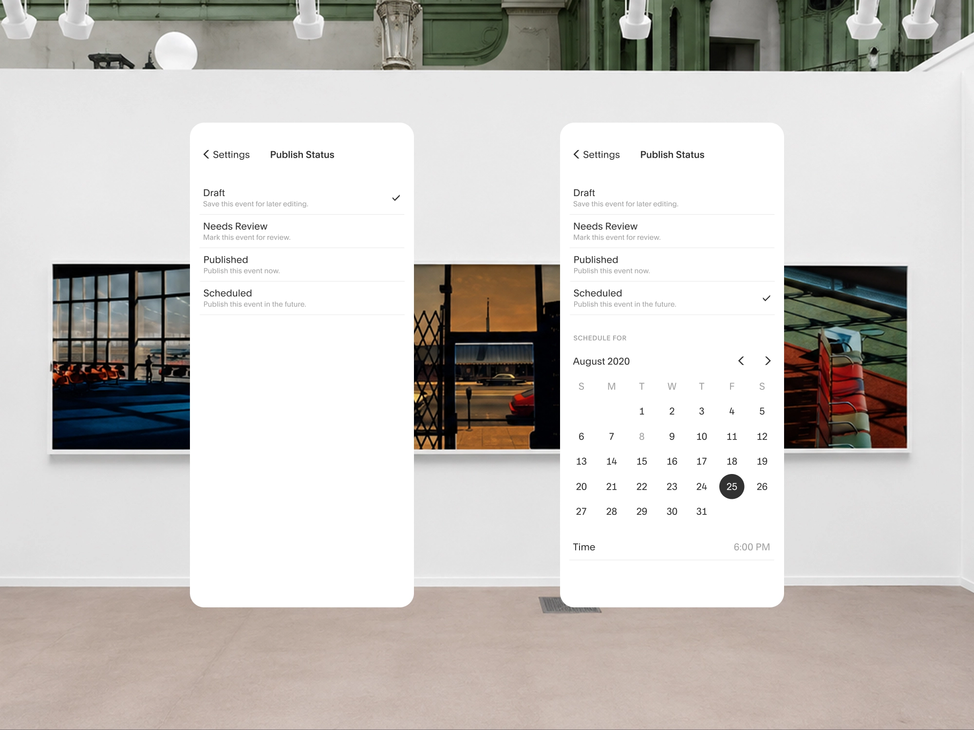
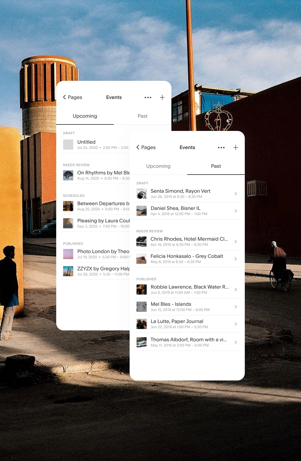
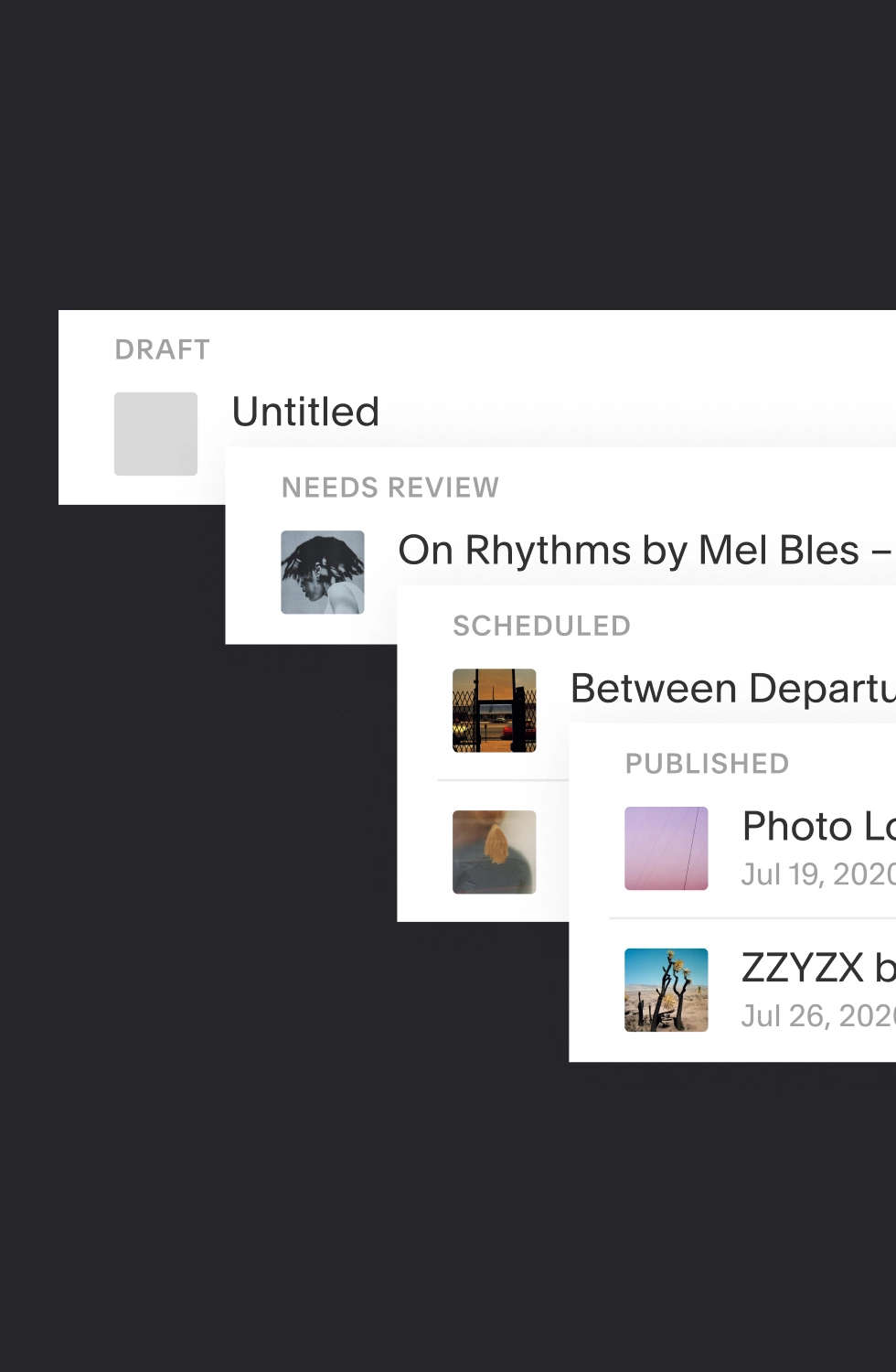
Publish status gave creators control over when an event was ready to go live while making its current state easy to understand. Draft, Needs Review, Scheduled, and Published provided clear stages for work in progress, with scheduling options appearing when needed. Those same states carried into the Events list, grouping work by status so creators could quickly see what required attention, what was scheduled ahead, and what was already live.
Reflection
Squarespace taught me to think beyond the feature in front of me. Every decision had to work within a larger product creators already understood, which meant considering not only whether an experience worked on its own, but whether it strengthened the system around it. That thinking shaped everything from adapting Site Styles and Pages to building Events on patterns already familiar to creators. It became an early lesson in designing for continuity: knowing when a product needs a new idea, and when the better decision is to make what already works go further.
BetterMe
Wellness